This Chart’s Shape Shows Where Markets Will Go Next
This article was originally published on this site
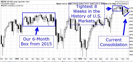
After a few weeks of “spirited” and profitable activity in the middle of September, in which we broke below the eight-week “ultra-tight” range and bounced up, the markets have settled back into the doldrums that have defined the past few months.
In fact, for the past two years, U.S. markets have managed to move from trading-range box to trading-range box.
But now stock prices have formed a whole new chart pattern. I’ll show you what that looks like in the context of the last two years of the S&P 500 cash index andup close.
It tells you everything you need to know about the future direction of the market…
Out of the Box… and into the Triangle
I’ve mentioned Robert Edwards and John Magee – the godfathers of technical analysis – and their influential work on market patterns, “Technical Analysis of Stock Trends.” This popular tome is currently on its 10th edition; it’s been reprinted dozens of times.
It’s safe to say all market “technicians” are fans of “Technical Analysis”… and I’m no different. Just like the Man or Rabbit in the Moon, once you read Edwards & Magee, you can’t help but “see” these patterns and shapes just jump out at you…
…especially at the end of a consolidation period, in this case within 1% to 3% of all-time highs.
You can see that, along with 24 months of context, immediately below:

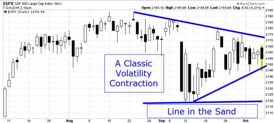
Let’s look at the S&P 500 on a much tighter time frame to see this price consolidation from above in more detail:

In short, a break above the Sept. 22 and Sept. 30 highs with a close above 2,180 will be quite bullish and should lead to a push up above the all-time highs.
On the other hand, a break and close below the 2,140 zone will bring our “Line in the Sand” back into play – in the form of lots more downside pressure.
It would be a smart move to stay flexible and prepared for either.


